Thursday, July 15, 2010

SharePoint 2010 Themes

As you all know SharePoint has a new theme engine for 2010. You can do cool things such as create a theme in PowerPoint, export it and then import it into SharePoint 2010, click apply and you got a custom theme. One aspect that I could not find documented is the definition of when you choose a color for a particular element what is it really changing?

If you modify the theme for a site you can use the picker to choose a OOTB or custom theme. Or you have the ability to choose your own color scheme via the following elements.

image

My approach: Make each element white to start with and then one by one add color and document the results. Just for kicks here is what it looks like when it is completely white… (not a color scheme I would recommend…) I will be using a red color: #C12345 for testing.

image

Here are the details for each one of the elements above:

Text/Background- Dark 1 (41 Classes)

image

  • Page Title Hyperlink Text
  • Hover Text
  • VB Body Text
  • Site Action Menu Text
  • Left Navigation Links Text
  • Site Setting Page Text Headers

Text/Background - Light 1 (37 Classes)

image

  • Body Background
  • Toolbar Background
  • Quick Launch Borders
  • Web Part Header Background
  • Site Action Menu Background
  • Site Action/Welcome Text Color
  • Pop-Up Window Background

Text/Background - Dark 2 (43 Classes)

image

  • Top Banner Background
  • Left Navigation Header Text
  • Recycle Bin/View All Site Content Text
  • I Like/Tags Notes Text
  • Library Column Text
  • Site Action Drop Down Border
  • Breadcrumb Current Location Text
  • List Description Text

Text/Background - Light 2 (19 Classes)

image

image

  • Browse Tab and hover Background
  • Title Container Background
  • Top Links/Header 2 Background
  • Quick Launch Background
  • Web Part Adder Background

Accent 1 (10 Classes)

image

  • Quick Launch Hover Text
  • Top Link Selected Tab

Accent 2 (4 Classes)

image

  • .ms-error
  • Rich Text Colored Heading 2 Text Styles

Accent 3 (9 Classes)

image

  • Rich Text “Caption” Style Text Color

Accent 4 (5 Classes)

image

  • Border Under Web Part Selector

Accent 5 (3 Classes)

image

  • Rich Text Colored Heading 4 Text Styles

Accent 6 (3 Classes)

image

  • Rich Text Highlight background color

Hyperlink (12 Classes)

image

  • Toolbar Text Color
  • VB Body Hyperlink Text
  • a:link Class Text Color
  • Web Part Title Hyperlink Text (Not Visited)

Followed Hyperlink (2 Classes)

  • .ms-WPBody a:visited
  • a:visited

I hope this post will help you when you decide to create your own theme via the above elements. If you create your own theme you can simply view the source of the page and there will be a unique CSS style sheet reference “_themes/16/corev4-8digithex.css?ctag=#”. Just copy that url and past it to the end of your site stringhttp://yoursitename.com/ and you can download the custom file.

Style Individual Navigation Items for 2007 & 2010

Here is a simple yet effective way to stylize individual top navigation items for SharePoint 2007 & 2010 just using CSS. SharePoint 2010 will need a slight modification to the master page but the same effect can be achieved. See bottom of post for 2010 implementation.

To start off with lets review how this can be accomplished for 2007. SharePoint 2007 provides a unique ID for each note in the navigation.

  1. 1st Tab: Dedicated as your default Home or root node
    • ID: zz1_TopNavigationMenun0
  2. 2nd Tab: This is the first child node from the root
    • ID: zz1_TopNavigationMenun1
  3. 3rd Tab: This is the second child node from the root
    • ID: zz1_TopNavigationMenun2
  4. 4th Tab: This is the third child node from the root
    • ID: zz1_TopNavigationMenun3

See the pattern… It keeps going and going. Here is what it looks like from the IE DOM Explorer in IE8:

image

So you might ask well what can I do with this unique ID? Well here is a quick sample of what you can do. Its not pretty but it shows off that you can have a custom Icon, background color, font, etc. for each node in the navigation.

image

Here is the CSS and OOTB Icon references that I used to create the above design. So how does it work? Basically it combines the trigger of the unique ID and attaches it to the class of “ms-topnav a”. You will notice that I had to do a funky bit of css to fill in the background behind the arrow for news.

.ms-topnav{
border: none;
background-color: transparent;
background-image: none;
font-weight: bold;
}
#zz1_TopNavigationMenun0 .ms-topnav a{
background-image: url(/_layouts/images/newshomepage.png);
background-repeat: no-repeat;
background-position: -40px -3px;
background-color: #006699;
border: 1px #006699 solid !important;
padding:18px 20px 0px 80px;
height: 54px;
color: #FFF;
}
#zz1_TopNavigationMenun1 .ms-topnav a{
background-image: url(/_layouts/images/PLICON.PNG);
background-repeat: no-repeat;
background-position: -40px -3px;
background-color: #FF9933;
border: 1px #FF9933 solid !important;
padding:18px 20px 0px 80px;
height: 54px;
color: #FFF;
}
#zz1_TopNavigationMenun2 .ms-topnav a{
background-image: url(/_layouts/images/ANNOUNCE.PNG);
background-repeat: no-repeat;
background-position: -40px -3px;
background-color: #336633;
border: 1px #336633 solid !important;
padding:18px 20px 0px 80px;
height: 54px;
color: #FFF;
}
#zz1_TopNavigationMenun2 .ms-topnav td{
background-color: #336633;
}
#zz1_TopNavigationMenun3 .ms-topnav a{
background-image: url(/_layouts/images/ReportCenter.png);
background-repeat: no-repeat;
background-position: -40px -3px;
background-color: #990000;
border: 1px #990000 solid !important;
padding:18px 20px 0px 80px;
height: 54px;
color: #FFF;
}
#zz1_TopNavigationMenun4 .ms-topnav a{
background-image: url(/_layouts/images/SMT_LARGE.PNG);
background-repeat: no-repeat;
background-position: -40px -3px;
background-color: #660066;
border: 1px #660066 solid !important;
padding:18px 20px 0px 80px;
height: 54px;
color: #FFF;
}
#zz1_TopNavigationMenun5 .ms-topnav a{
background-image: url(/_layouts/images/categories.png);
background-repeat: no-repeat;
background-position: -40px -3px;
background-color: #999;
border: 1px #999 solid !important;
padding:18px 20px 0px 80px;
height: 54px;
color: #FFF;
}

So how do you do this for SharePoint 2010…

Well first you will need to modify the master page and do a search for “UseSimpleRendering="true"”. This basically tells SharePoint to render the navigation using a clean unordered list

format.

Since this is so clean, it does not have any unique ID’s attached to it like it did in SharePoint 2007.

image

So if you change it to false: UseSimpleRendering="false" you can clearly see that each node now has a unique ID:

image

So if we simply take the same approach for 2007 we can get similar results. You will notice the only difference in the ID’s from 2007 to 2010 is that they put in a “V4” after the word “Menu” and before the “n#”

  1. 2007 ID: zz1_TopNavigationMenun0
  2. 2010 ID: zz1_TopNavigationMenuV4n0

You can also remove the “ms-topnav” since it is not needed. You should end up with something like this:

image

Below is the CSS that I used to achieve the design above for SharePoint 2010. Remember you need to make that modification to the master page noted above to get this to work. Also notice that I kept the “a” reference at the end of each ID.

#s4-topheader2{
border: none;
background-color: transparent;
background-image: none;
font-weight: bold;
height: 54px;
padding-bottom: 5px;
}
#zz1_TopNavigationMenuV4n0 a{
background-image: url(/_layouts/images/newshomepage.png);
background-repeat: no-repeat;
background-position: -40px -3px;
background-color: #006699;
border: 1px #006699 solid !important;
padding:18px 20px 18px 80px;
color: #FFF;
}
#zz1_TopNavigationMenuV4n1 a{
background-image: url(/_layouts/images/PLICON.PNG);
background-repeat: no-repeat;
background-position: -40px -3px;
background-color: #FF9933;
border: 1px #FF9933 solid !important;
padding:18px 20px 18px 80px;
color: #FFF;
}
#zz1_TopNavigationMenuV4n2 a{
background-image: url(/_layouts/images/ANNOUNCE.PNG);
background-repeat: no-repeat;
background-position: -40px -3px;
background-color: #336633;
border: 1px #336633 solid !important;
padding:18px 20px 18px 80px;
color: #FFF;
}
#zz1_TopNavigationMenuV4n3 a{
background-image: url(/_layouts/images/ReportCenter.png);
background-repeat: no-repeat;
background-position: -40px -3px;
background-color: #990000;
border: 1px #990000 solid !important;
padding:18px 20px 18px 80px;
color: #FFF;
}
#zz1_TopNavigationMenuV4n4 a{
background-image: url(/_layouts/images/SMT_LARGE.PNG);
background-repeat: no-repeat;
background-position: -40px -3px;
background-color: #660066;
border: 1px #660066 solid !important;
padding:18px 20px 18px 80px;
color: #FFF;
}
#zz1_TopNavigationMenuV4n5 a{
background-image: url(/_layouts/images/categories.png);
background-repeat: no-repeat;
background-position: -40px -3px;
background-color: #999;
border: 1px #999 solid !important;
padding:18px 20px 18px 80px;
color: #FFF;
}

Enjoy!

Alternative way to Change Site Logo

OOTB SharePoint allows you to change the logo of the page from the default: titlegraphic.gif image to another image by going into site settings > Title, Description, and Icon.

The following method is a way to add a new logo to your page with just CSS. If you wanted to make this more global you will need to use an alternate method to override the default CSS classes.

  • Upload your new logo to either the server or to a list on your site.
  • Add a Content Editor webpart to the page.
  • Add in the following to the source viewer.

  • In the example above I have uploaded the xyzcorp.gif logo to the images folder on the server.
  • Make sure you modify the elements above in bold green: logo name, height, and width (of logo).
  • Save the page and you should now have the new logo on the page.

Default:
image

Modified:
image

Change SharePoint Search Icon with Just CSS

I created a post awhile ago on how to change the SharePoint site logo via CSS so that you don’t have to modify the titlegraphic.gif file on the file server or change it via the UI for every site to make a global change.

I have a simple solution that changes the search GO icon from the standard image to something more custom image with just CSS.

The icon is not specified via the master page so you will not be able to change it there.


You might be tempted take the route of changing the following files on the server and replacing them with your own custom ones. But I have an alternative that works just as well and you don’t have to mess with any of these base Image files.

  1. GOSEARCH.GIF
  2. ICONGO01.GIF
  3. ICONGO02.GIF
  4. ICONGO03.GIF

Upload your custom images to a sub folder within the following directory: C:\Program Files\Common Files\Microsoft Shared\Web Server Extensions\12\TEMPLATE\IMAGES\YourCustomFolder

Then in your custom CSS simply place the following CSS:

td.ms-sbgo{
background-color:transparent;
padding-left:3px;
padding-right:3px;
padding-bottom:0px;
padding-top:0px;
border:solid 0px #949494;
}
td.ms-sbgo a{
padding: 0px 0px 0px 0px !important;
margin: 0px 0px 0px 0px !important;
}

td.ms-sbgo a{
background-image: url(/_layouts/images/yourcustomfolder/custom_search.gif);
background-repeat: no-repeat;
background-position: top left;
}
td.ms-sbgo a img{
visibility: hidden;
height: 17px;
width: 17px;
}

You will simply just have to change the folder name, image name, and the height and width of the image to be specific to you and you should be good to go. The result should look something like this:

image

SharePoint 2010 Base CSS Classes

This will be the first of many SharePoint 2010 posts. I will be focusing on a few of the main CSS classes used for SharePoint 2010 Public Beta. As the product becomes more final there might be some changes to the class names but I will be sure to create a new post if that happens. This will be quite a lengthy but it should be helpful. The default CSS given below are just highlights of the full CSS attributes for that class.

I will be using a basic team site as my base for the screenshots.

image

Here is a basic structure of the main areas that I will cover.

  1. Ribbon Row
    • Table Row Left
      • Site Actions
      • Navigate Up
      • Edit
    • Tab List
      • Browse
      • Page
    • Table Row Right
      • Give Feedback
      • Welcome Menu
  2. Workspace
    • Body Container
      • Title Row
        • Title
          • Title Logo
          • Title Text / Breadcrumb
            • Page Description
          • Social Data
            • Separator
            • I like It
            • Tags/Notes
        • Top Header 2/Top Links
          • li Static-Selected
          • li Static
          • Search
          • Help
      • Status Bar Container
      • Main Area
        • Left Panel
          • Navigation Manager
            • li Static (Header)
            • ul li Static (Link)
          • Special Navigation Links List
            • Recycle Bin
            • View All Site Content
        • Content Table / Body Area
          • Web Part Cell
            • Web Part Header
              • WP Title
              • WP Header TD
              • WP Header Menu
              • WP Header Selection
            • Web Part Content

Ribbon Row:
Class/ID = “body #s4-ribbonrow”
Default CSS:
min-height:43px;
background-color:#21374c;
Comments: This is the container for all of the items in the top ribbon
image

Table Row Left:
Class/ID = “ms-cui-TabRowLeft”
Default CSS:
float:left;
margin-top:20px;
Comments: This is the container Site Actions, Navigate Up and Edit
image

Site Actions:
Class/ID = “ms-siteactionsmenuinner”
Default CSS:
border-color:#21374C;
border-top-color:#394f63;
background:url("/_layouts/images/bgximg.png") repeat-x -0px -467px;
background-color:#21374c;
Comments: Main Style for Site Actions menu
image

Navigate Up:
Class/ID = “.s4-breadcrumb-anchor,.ms-qatbutton”
Default CSS:
margin:0px 3px 0px 0px;
padding:2px 5px 0px;
Comments: There is an image “fgimg.png” that sits within an “A” hyperlink Tag. This image is large and has many icons in it. It uses inline absolute positioning to show the correct Icon.
”position: absolute; top: -112px !important;”
image

Here is what the “fgimg.png” image looks like:

FGIMG

Edit:
Class/ID = “.s4-breadcrumb-anchor,.ms-qatbutton” (Same as Above)
Default CSS:
Same As Above
Comments: Same as above except that the background image position is different. “position: absolute; top: -235px;”
image

Browse:
Class/ID = “.ms-cui-tt-s > .ms-cui-tt-a”
Default CSS:
border-color:#b6babf;
background-color:#fff;
color:#23272c !important;
Comments: This is the selected state of the browse button. Note the “s” at the end of the class.
image

Page:
Class/ID = “.ms-cui-tt-span”
Default CSS:
padding:4px 10px 4px;
border-top:1px solid transparent;
text-align:center;
Comments: This is the non-selected state of the page button.
image

Give Feedback:
Class/ID = “No Class Or ID Specified, See below”
Default CSS:
Inline CSS and Image
Comments: If you would like to remove this icon via CSS, use the following:
.ms-cui-TabRowRight a img{
display: none;
}

image

Welcome Menu:
Class/ID = “.ms-welcomeMenu”
Default CSS:
padding:2px 5px 3px;
margin:0px 3px;
font-size:1em;
font-family:Verdana,sans-serif;
border:1px solid transparent;
Comments: The class for the arrow is “.ms-viewselector-arrow”
image


Workspace:
Class/ID = “body #s4-workspace”
Default CSS:
overflow:visible !important;
overflow-y:scroll;
overflow-x:auto;
position:relative;
left:0px;
Comments: This is the container and scroll area for the site.
image

Body Container:
Class/ID = “body #s4-bodyContainer”
Default CSS:
min-width:760px;
Comments: This class controls the minimum width.

Title Row:
Class/ID = “body #s4-titlerow”
Default CSS:
display:block !important;
Comments: This is the container for the Title, Tags, Ribbon, Main navigation, Search and Help.
image

Title Row:
Class/ID = “.s4-title”
Default CSS:
padding:0px 0px 0px 10px;
margin:0px;
min-height:64px;
background:url("/_layouts/images/bgximg.png") repeat-x -0px -1013px;
background-color:#f9f9f9;
word-wrap:break-word;
-ms-word-wrap:break-word;
overflow-x:hidden;
Comments: Notice that there is a min height of 64px and a background image is applied by default.
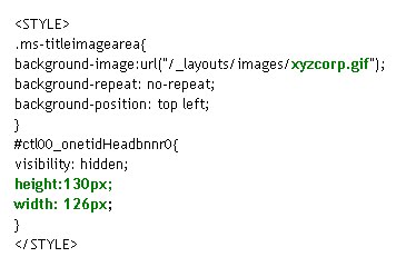
imageTitle Logo:
Class/ID = “.s4-titlelogo”
Default CSS:
padding:12px 10px 12px 0px;
text-align:center;
vertical-align:middle;
Comments: The logo can be changed via the Admin UI. Default Image size is 35x35px
image

Title Text:
Class/ID = “.s4-titletext”
Default CSS:
width:100%;
Comments: The title text is also the bread crumb.
image

Page Description:
Class/ID = “.s4-title .s4-pagedescription,.s4-title .s4uniqpermdescription”
Default CSS:
margin-top:6px;
font-size:1em;
color:#5d6878;
font-weight:normal;
Comments: This only shows up if you have specified a description of the site.
image

Social Data:
Class/ID = “ms-socialNotif-Container”
Default CSS:
width:120px;
overflow-x:auto;
overflow-y:hidden;
padding:0px 3px;
Comments: This is the container that holds both I Like It and Notes.
image

Social Separator:
Class/ID = “.ms-socialNotif-groupSeparator”
Default CSS:
height:60px;
position:relative;
top:4px;
margin:0px 3px;
border-right:1px solid;
border-right-color:#e7e7e8;
Comments: This is the slight line on the left of the social tags.
image

I Like It:
Class/ID = “.ms-socialNotif”
Default CSS:
width:48px;
height:60px;
overflow:hidden;
margin:0px 1px;
padding:0px 2px;
border:1px solid transparent;
Comments: This class is shared with the tags and notes. The text uses the class “.ms-socialNotif-text” and the image “mossfgimg.png” with inline style of
position: absolute; top: -132px !important;

Here is what the “mossfgimg.png” image looks like:

MOSSFGIMG

Tags & Notes:
Class/ID = “.ms-socialNotif”
Default CSS:
Same As “I Like It” above
Comments: This class is shared with the I like It Feature. The image “mossfgimg.png” with inline style of
position: absolute; top: -300px !important;

Top Header 2:
Class/ID = “body #s4-topheader2”
Default CSS:
background:url("/_layouts/images/selbg.png") repeat-x left top;
background-color:#f6f6f6;
vertical-align:middle;
min-height:25px;
border-top:1px solid #e0e0e0;
border-bottom:1px solid #b8babd;
Comments: This class makes up the majority of the navigation row style.

Top Links:
Class/ID = “.s4-toplinks”
Default CSS:
padding:0px;
Comments: This is the container for the main navigation, search and help.
image

Top Link Selected:
Class/ID = “.s4-toplinks .s4-tn a.selected”
Default CSS:
border-color:#91cdf2;
border-bottom-color:#addbf7;
border-top-color:#c6e5f8;
background:url("/_layouts/images/selbg.png") repeat-x left top;
background-color:#ccebff;
color:#003759;
padding:4px 5px;
margin:0px 5px;
Comments: The hover class is “.s4-toplinks .s4-tn a.selected:hover”
image

Top Link Static:
Class/ID = “.s4-tn li.static > .menu-item”
Default CSS:
color:#3b4f65;
white-space:nowrap;
border:1px solid transparent;
padding:4px 10px;
height:15px;
Comments: The hover class is “.s4-tn li.static > a:hover”
image

Search:
Class/ID = “.s4-search table”
Default CSS:
width: 212px;
margin-right: 17px;
Comments: This is the container for the search box. The class resides in the Search.css file.
image

Search Input:
Class/ID = “.s4-search input”
Default CSS:
width: 212px;
margin-right: 17px;
Comments: Note that this class does not change width, border color or height. You could use this to change the background color.

Search Image:
Class/ID = “.s4-search .ms-searchimage”
Default CSS:
background-color:#fff;
border:1px solid #e3e3e3 !important;
height:16px;
padding:2px 3px 1px;
border-left:none !important;
margin-top:3px;
Comments: This class controls the border around the go image.
image

Help:
Class/ID = “.s4-help”
Default CSS:
margin:4px;
Comments: This uses the “fgimg.png” with inline style of:
position: absolute; top: -293px !important;
image


Status Bar Container:
Class/ID = “.s4-statusbarcontainer”
Default CSS:
None
Comments: I am not 100% sure where or how this is used. I can only imagine that this is a publishing class.

Main Area:
Class/ID = “body #s4-mainarea”
Default CSS:
float:left;
clear:both;
Comments: This includes both left navigation and content
imageLeft Panel:
Class/ID = “body #s4-leftpanel”
Default CSS:
width:155px;
float:left;
Comments: This is the left navigation
image

Left Panel Headers:
Class/ID = “.s4-ql ul.root > li > .menu-item,.s4-qlheader,.s4-qlheader:visited”
Default CSS:
font-size:1.2em;
color:#0072bc;
margin:0px;
padding:3px 4px 3px 10px;
word-wrap:break-word;
overflow-x:hidden;
Comments: This class controls the look of the header text
image

Left Panel Links:
Class/ID = “.s4-ql ul.root ul > li > a”
Default CSS:
padding:3px 4px 4px 10px;
color:#3b4f65;
word-wrap:break-word;
overflow-x:hidden;
zoom:1;
Comments: This class controls the look of the link text
image

Special Navigation Links List:
Class/ID = “.s4-specialNavLinkList”
Default CSS:
margin:0px;
border-top:1px solid #dbddde;
padding-top:5px;
Comments: This class makes the line above the recycle bin
image

Recycle Bin:
Class/ID = “.s4-specialNavLinkList a”
Default CSS:
padding:3px 4px 3px 10px;
color:#3b4f65;
Comments: This is a shared class with view all site content
image

View All Site Content:
Class/ID = “.s4-specialNavLinkList a”
Default CSS:
Same As Above
Comments: This is a shared class with Recycle Bin
image

Content Table Body Area:
Class/ID = “.s4-ca”
Default CSS:
margin-left:155px;
margin-right:0px;
min-height:324px;
Comments: This is main class for the body content. Notice the 155px margin to the left. This basically moves the content over so that it does not overlap the left navigation.
image

Web Part Cell:
Class/ID = “.s4-wpcell”
Default CSS:
border:1px solid transparent;
Comments: This would be a good class to define a pixel line around web parts.
image
Web Part Header:
Class/ID = “.ms-WPHeader”
Default CSS:
background-color:#FFFFFF;
Comments: This controls the background color of the wp header.

Web Part Header TD:
Class/ID = “.ms-WPHeader td”
Default CSS:
border-bottom:1px solid #EBEBEB;
Comments: This controls the border color of the wp header.

Web Part Header Menu:
Class/ID = “.ms-WPHeaderTdMenu”
Default CSS:
width:21px;
border:1px solid transparent;
Comments: This class is for the web part menu spacing.
image

Web Part Header Selection:
Class/ID = “.ms-WPHeaderTdSelection”
Default CSS:
width:21px;
Comments: This class is for the web part selector spacing.
image

Web Part Content:
Class/ID = “.ms-wpContentDivSpace”
Default CSS:
margin-left:5px;
margin-right:5px;
Comments: This class adds marginal space left and right for the web part content.

There are many many many more classes that I could cover but these are some of the main ones to get you going. I will cover more in future posts.

Please leave a comment!